Merlin Power Rebranding Guidelines

Intro
This guide provides a cohesive framework and a comprehensive set of guidelines that, when applied correctly, ensure every rebranded product remains unmistakably aligned with the Merlin Power identity.
For further support, contact:
Marketing Department
marketing@merlin-power.com
T: +44(0)1202 697979
Contents
Physical Product Design
This section introduces the core design principles for creating consistent, professional, and on-brand products.
Every Merlin Power product should embody the company’s commitment to quality, innovation, and brand consistency while ensuring a seamless user experience.
The design of each product should be visually aligned with the Merlin Power brand.
A well-executed product design enhances both brand recognition and usability. From the placement and scaling of the product name and logo to the colour application,
each element must be thoughtfully considered to create a cohesive and recognisable product line.
This section will outline the key guidelines that must be followed during the physical product design process, including:
Logo Placement – clear space, scaling, and positioning
Product Information Application – typography, sizing and positioning
Colour and Branding Elements – defining primary, secondary, and contrast colors to maintain a consistent brand style across all products.
By following these principles, we ensure that every Merlin Power product reflects the brand’s identity,
meets high design standards, and provides a premium and professional experience for customers.

Logo Formatting
This section provides specific guidelines for applying the Merlin Power logo on products. Consistent logo placement, sizing,
and clear spacing are essential for maintaining brand recognition and visual balance across all product designs.
These guidelines ensure that the logo is legible, proportionate, and visually aligned with the other design elements on the product.
Positioning
- The preferred position for the Merlin Power logo is the bottom right of the designated product information area.
- If product sizing or constraints make this placement unbalanced or impractical, an alternative position may be considered, ensuring alignment with the overall design. (See Example 3)
- The logo should always be placed in a prominent and unobstructed area to maximise visibility and brand recognition.
Clear Space
- To maintain legibility and visual impact, the Merlin Power logo must always have sufficient clear space around it.
- The required minimum clear space around the logo should be defined by the width of the "P" in the word "Power" within the logo.
- No text, graphics, or functional elements should be placed within this space to ensure that the logo remains distinct and readable.
Sizing
- The logo should be proportionally sized to the product rather than following fixed dimensions.
- It must be large enough to be clearly visible from a standard viewing distance without overwhelming other design elements.
- When resizing, always maintain the aspect ratio to prevent stretching or distortion.
By adhering to these logo formatting guidelines, we ensure that the Merlin Power brand remains strong, recognisable, and consistent across all physical products.
Information Formatting
This section provides guidelines for applying product information on Merlin Power products.
Proper placement, typography, and sizing ensure that essential details—such as the product name, additional product text,
and regulatory markings (e.g. CE markings) are clear, legible, and visually consistent across all products.
Product Name
- The product name should be set in Barlow Semibold, maintaining a clear and professional appearance.
- The preferred position for the product name is the top left of the designated product information area.
- If the shape or design of the product makes left alignment appear unbalanced, a centered placement may be used as an alternative. (See Example 3)
- The product name should be proportionally sized to fit the available space while ensuring readability from a standard viewing distance.
Product Text
- If additional text is required (e.g., model numbers, product specifications, or product descriptions), it should be set in Barlow Regular
to differentiate it from the product name while maintaining visual consistency.
- This text should be positioned beneath the product name and aligned accordingly to create a structured layout.
- The size of this text should be smaller than the product name but large enough to be easily legible.
Regulatory Markings & Symbols
- Mandatory regulatory markings (such as CE symbols) must be included where required.
- These markings should be positioned neatly within the product information area, typically at the bottom left of the section to avoid interference with the product name and text. (See Example 2)
- Symbols should be scaled appropriately to remain readable without overpowering other product information.
- All regulatory markings must maintain the correct aspect ratio and follow their respective compliance requirements.
By following these guidelines, we ensure that product information is presented in a professional, structured, and consistent manner,
reinforcing the Merlin Power brand identity while maintaining compliance with any industry standards.

Colour & Branding Elements
The consistent application of colour across all Merlin Power products is crucial for reinforcing brand identity and ensuring a cohesive and professional product lineup.
The following guidelines define how the primary and secondary brand colours should be applied in a balanced and effective manner.
Primary & Secondary Colours
- Black (#000000) – Primary Surface Colour
- Black should be the dominant colour used across the main body of the product.
- It serves as the base colour, providing a sleek, professional, and high-contrast background for branding elements.
- Merlin Blue (#0022EE) – Secondary Accent Colour
- Merlin Blue must always be present somewhere on the product, ensuring brand consistency and visibility.
- While secondary to black, Merlin Blue should be used on smaller sections, such as end covers, information areas, and other accent features.
- If only certain sections of the product can be customised, those areas should prioritise Merlin Blue to reinforce brand identity. (See Example 2)
- Merlin Dark Blue (#000F46) – Rare Use for Contrast
- Merlin Dark Blue should be used sparingly and only when a darker contrast is needed against the Merlin Blue. - It is ideal for design elements like buttons that are placed on a Merlin Blue background, providing necessary contrast without disrupting the overall branding aesthetic. (See Example 3) - Merlin Dark Blue should never overwhelm the Merlin Blue and must be used in moderation to maintain consistency.
- White (#FFFFFF) – Text and Branding Elements
- All text, logos, and regulatory markings should be white to ensure maximum contrast against both black and Merlin Blue surfaces.
Single-Colour Product Designs
- If the product design only allows for a single colour, then it must be black as the primary surface colour.
- In this case, Merlin Blue must still be incorporated by using it for the logo and product information text instead of white.
- This ensures that Merlin Blue remains present somewhere on the product, maintaining consistency with the brand identity.
By following these colour and branding guidelines, every Merlin Power product will maintain a strong, recognisable identity,
balancing the dominance of black with the strategic visibility of Merlin Blue, while ensuring maximum readability with white or blue text and branding elements.

Packaging Layout & Design
This section provides the key guidelines for designing the packaging of Merlin Power products. The packaging consists of a plain white box with a branded sleeve.
This ensures a professional, consistent look across all of our rebranded products.
The sleeve design is divided into four key sections, each with a specific role in communicating product information and reinforcing the brand identity:
Front Side: This is the primary brand-facing side, designed to make a strong first impression. It features the Merlin Logo,
a wireframe image of the product, and the product name.
Back Side: This side provides detailed product information, including a written product overview and a technical wireframe diagram.
It ensures customers have a clear understanding of the product.
Left Side: The left panel is structured for product features and benefits. It includes a description of the product and it's uses, a list of bullet point features
and a QR code linking to the products page on the Merlin website.
Right Side: This panel features a to scale wireframe image of the product on its side as it can be found in the box, as well as a QR code linking to the products page on the Merlin website, the Merlin Power logo and the product name.
By following these guidelines, Merlin Power packaging will remain clear, professional, and highly recognisable, ensuring a consistent experience for customers.

Front Side
This is the primary visual representation of the product and brand. It should be bold, striking, and immediately recognisable.
Required Elements:
Merlin Logo:
Positioned at the centre top of the sleeve for strong brand visibility.
Wireframe Image of the Product:
A technical line drawing, centrally placed to provide a clear representation of the product.
Brand Promise – POWER. IN. ACTION.:
Placed at the bottom underneath the wireframe image. This is used to help reinforce the Merlin Power identity and values.
Colour Usage:
Background Colour:
Merlin Blue (#0022EE) to ensure a strong and recognisable brand presence.
Element Colours:
All text, graphics, and logos must be white, creating a high-contrast, clean, and professional aesthetic.
This layout maintains brand consistency, clarity, and impact, ensuring that the front of the packaging aligns seamlessly with the Merlin Power brand.

Back Side
The back side serves as a detailed product information hub, ensuring customers clearly understand the product’s key features, functionality, and physical dimensions.
This side is split into two sections:
Left Section – Product Overview:
- A written summary of the product’s key features, applications, and benefits.
- This text should be concise yet informative, following the Merlin brand tone—clear, professional, and technical where necessary.
- The overview must be easy to scan, using bullet points where applicable.
- The background should be white, ensuring maximum readability.
Right Section – Technical Wireframe Diagram:
- A non-scaled wireframe illustration of the product, presented in Merlin Blue.
- Dimensions should be displayed along each key measurement to provide customers with a clear sense of size.
- Labels must use a consistent font and sizing in line with the branding guidelines.
This layout ensures that the back of the package serves as an informative reference point, giving customers essential details without cluttering the design.

Left Side
The left panel is dedicated to technical specifications, product traceability, and digital connectivity, providing essential information in a structured, easy-to-read format.
Left Section – Product Specification Table:
- Covers two-thirds of the panel’s width, aligned left.
- Displays key technical specifications which can be found on the products datasheet specification table.
- The table design should use consistent typography, line spacing, and grid structure for clarity.
Right Section – Serial Number & QR Code:
- A dedicated space for the product serial number, ensuring easy identification.
- A QR code, linking directly to the Merlin website for additional product details, support, and documentation.
- The QR code must be high contrast, ensuring easy scanning.
Vertical Merlin Blue Strip:
- Running along the far-right edge of the panel, this strip contains the Merlin website URL written vertically (bottom to top).
- This element subtly reinforces the brand identity while adding a professional design touch.
This structured layout ensures the left panel remains functional, clear, and aligned with Merlin’s technical focus.

Right Side
The right panel is designed to reinforce branding, compliance, and product identification, ensuring that regulatory markings and essential product details are easily visible.
Large Merlin ‘M’ Logo:
- A prominent branding element, spanning from the left edge to the right edge of the panel.
- Must maintain correct proportions, ensuring a strong visual identity when viewed from any angle.
CE Markings & Copyright Statement:
- Positioned above the left section of the ‘M’ logo.
- Includes any required compliance markings (such as CE) to indicate safety and certification standards.
- A small copyright statement for Merlin Power, ensuring intellectual property protection.
Merlin Product Name & Part Number:
- Located above the middle-right section of the ‘M’ logo.
- Includes the official Merlin product name and corresponding part number.
- Text must be clear, using Merlin’s standard font and size, ensuring legibility at a glance.
This panel ensures that all essential product identifiers and compliance details are visible while maintaining a strong, professional brand presence.

Quick Start Guide Layout & Design
This section provides the key guidelines for designing a rebranded products quick start guide. The quick start guide is a compact, fold-out document designed to simplify the installation and setup process for customers.
Serving both as a practical reference and a branded experience, this guide presents essential technical information in a clear, accessible format, helping customers to get started with confidence.
Folded down to the size of a standard business card and expanding into a double-sided A4 sheet, the guide includes product visuals, wiring instructions and configuration details.

Folded View: Front
This side of the guide is what the customer will first see when they open the box. Its layout is clean and functional, providing immediate access to basic information such as the product name, serial number, and a visual of the unit.
Top Left: Product name with the label “Quick Start Guide” directly below.
Left Centre: Designated space for the product serial number (left-aligned for consistency).
Bottom Left: Merlin Power logo to reinforce branding.
Right Side: 3/4 view wireframe of the product to support quick visual identification.

Folded View: Back
The reverse side of the folded guide offers a short welcome to the user, with a concise introduction to the product and a note of appreciation.
This section sets the tone for the guide, combining brand voice and purpose while helping build a positive customer relationship from the start.
Thank You Message: A short note of appreciation to the customer for choosing Merlin Power.
Product Introduction: A brief paragraph outlining the purpose and features of the product.
Quick Start Guide Explanation: A brief sentence explaining the purpose of the quick start guide.

Unfolded A4: Front
Once unfolded, this side provides detailed information critical for proper installation and wiring. It combines visual references and bullet-point instructions to minimise errors and reduce setup time.
Top Section:
Displays the folded front and back layouts side by side, maintaining brand consistency.
Centre Left:
Top-Down Wireframe Drawing: Depicts product dimensions with clear labelling.
Installation Notes: Bullet-pointed guidance on mounting, spacing, and safety considerations.
Centre Right:
Connection Diagram: Annotated wireframe showing all ports and connectors.
Wiring Instructions: Step-by-step bullet points to guide correct electrical connection.
Bottom Section:
Wiring Diagram: Full layout showing a correctly wired example of the product for visual reference.

Unfolded A4: Back
This side focuses on product interaction and configuration. It includes annotated diagrams to explain the interface, a settings reference table, and visual walkthroughs that demonstrate both how to configure the product
and what the user will see during operation.
Top Left:
Product Interface Wireframe: Annotated diagram indicating the function of each button and control.
Top Right:
Settings Reference Table:
- Column 1: Setting Name
- Column 2: Description, default values, and any relevant operational notes.
Bottom Section:
Setup Sequence Wireframes:
- A visual walk-through showing each step of the setup process.
- Includes key actions such as power-up, initial configuration, and interface navigation.
UI Feedback Wireframes:
- Images illustrating what the user will see on the device interface, including indicators, display states, and feedback from button presses.
- Aims to reduce confusion and ensure users understand the product's responses.

Manuals
This section introduces the core design principles for creating consistent, professional, and on-brand product manuals.
A well-designed manual is essential not only for clear communication but also for reinforcing the brand identity of Merlin Power.
Every product manual should reflect the company’s commitment to quality, ease of use, and customer satisfaction.
The layout and design of the manual must ensure that the product information is presented clearly and efficiently.
An organised structure helps users easily navigate the manual, find necessary information, and understand how to use the product safely and effectively.
From the typography to the page layout, every detail of the manual must follow a unified set of design principles to maintain consistency across all product lines.
Consistency in design is crucial. Each manual should follow a standard template, with pre-defined sections such as the introduction, setup instructions, troubleshooting,
and safety warnings, ensuring that customers can quickly find and understand the information they need. The brand’s visual elements—such as the logo, colour palette,
and typography—must be consistently applied to maintain a cohesive look and feel across all manuals.
This section will cover the key guidelines that should be followed in the manual design process, including typography, page structure, image usage, and layout standards.
These guidelines aim to ensure that the manuals are not only visually appealing but also functional, intuitive, and easy to follow.
By sticking to these principles, we guarantee that each product manual meets the highest standards of clarity, usability,
and branding consistency, allowing us to provide a better customer experience and reinforcing the identity of Merlin Power.

Typography and Text Formatting
For detailed typography and colour guidelines, please refer to the Merlin Power Brand Pad.
The following section provides specific manual-related guidelines for applying the typography and colours within the manual design:
Typography
Barlow is the main font to be used across all manual content.
- Product heading on the title page: Use Barlow Medium all caps, 36pt sizing, 200 wide tracking and 40.5 leading.
- Headings: Use Barlow Medium all caps, 24pt sizing, 100 wide tracking and 27 leading.
- Subheadings: Use Barlow Medium all caps, 12pt sizing, 100 wide tracking and 13.5 leading.
- Sub-Subheadings: Use Barlow Medium, 9pt sizing, 100 tracking and 13.5 leading.
- Body Text: Use Barlow Regular for standard text, Barlow Medium for highlighted text and Barlow Italic for 'Caution & Warnings' text, 9pt sizing, 0 tracking and 13.5 leading.
- Table Text: Use Barlow Regular, 8pt sizing, 0 tracking and 13.5 leading.
Colour Usage
- All Headings and Subheadings: Should be in Merlin Blue (#0022ee).
- Body text: Should be in black to ensure readability.
- Table text: Should be in Merlin Blue unless the text is on a Merlin Blue background, in which case the text should be white for contrast.
These guidelines apply specifically to the design and layout of manuals to ensure consistency with the broader brand identity.

Page Layout and Structure
For detailed page layout and structure guidelines, please refer to the Merlin Power Brand Pad.
The following section provides specific manual-related guidelines for structuring the manuals:
Grid System
We use a 12-column grid for flexibility and balance across all pages. Margins are adjustable but should maintain consistency for a clean design.
Typography
Body text is set to 9pt (or 8pt for small print or table text). All text aligns with a 12pt baseline grid to maintain consistency and technical precision.
Larger copy blocks may use multiples of 12 for custom grids.
Footer Design
- Ref Number and Issue Letter: These should be aligned to the left of the page, following the baseline grid. The ref number should be placed above the issue letter.
- Merlin Power Ltd: This should be centered on the page at the same height as the Ref number.
- Product Name + “User and Installation Guide”: This should also be centered, positioned directly below the Merlin Power Ltd text.
- Page Numbering: The page numbers (e.g., “Page: X of Y”) should be right-aligned, positioned at the same height as the Issue number to ensure uniformity.
By following these footer guidelines, we maintain a clean, organised structure that aligns with our technical and professional brand values.
Required Manual Sections
To ensure consistency, usability, and alignment with the Merlin brand, every manual must include specific sections that provide clear and essential information. These sections are carefully designed to guide users through the product’s operation and installation, making the manual both comprehensive and easy to navigate. Adhering to these requirements ensures a professional presentation and a seamless customer experience.
Title Page
The title page serves as the first point of interaction with the user and must be designed to ensure clarity, professionalism, and consistency with the Merlin brand. The following elements must be included:
1. Merlin Logo
Positioned in the top-left corner of the page, the logo reinforces brand identity and must always follow branding size and spacing guidelines.
2. QR Code
Placed in the top-right corner, the QR code should link to either the product's webpage or a video tutorial, offering easy access to further resources.
3. Product Title + User & Installation Guide
Positioned beneath the logo and QR code, this text should be left-aligned, written in all caps, and clearly state the product title followed by “User & Installation Guide.”
4. Revision Number
Directly beneath the product title, the revision number should be displayed using the format “Revision: X,” where X represents the specific version. This text must be left-aligned and written in title case for readability.
5. Wireframe Image
A D shot wireframe image of the product should be positioned below the product title, level with the revision text, and centered on the page for balanced visual focus.
6. Merlin Addresses
The company’s UK address must be listed below the wireframe image, center-aligned and written in title case. The USA address should be positioned directly beneath the UK address, maintaining the same formatting and alignment.
This structured layout ensures that the title page delivers essential information in a professional and visually appealing format, keeping it consistent with Merlin’s brand standards.

Contents
The Contents section serves as the manual’s table of contents, providing a structured overview of all headings and subheadings within the document.
This section ensures that users can quickly locate specific information, enhancing the manual’s usability and readability.
Each heading must be left-aligned, with a full-stop line extending across the page to the corresponding right-aligned page number. Subheadings should be indented beneath their respective headings, maintaining a clear and organised hierarchy.
This structured format allows users to navigate the manual efficiently, ensuring they can access the information they need with ease.

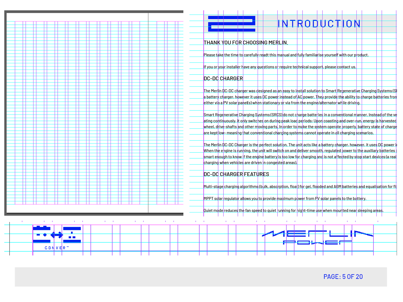
Introduction
The Introduction section provides customers with an overview of the product, including its key features, intended uses, and any essential information they should know before proceeding with the manual.
This section should begin with a thank you message, acknowledging the customer’s purchase and reinforcing Merlin’s commitment to quality and reliability.
It should then provide a clear and concise description of the product, explaining its primary function and benefits. This may include details on how the product operates,
what applications it is designed for, and any compatibility considerations.
Finally, this section must encourage users to read the manual thoroughly before installation and use, ensuring they fully understand the product’s features, setup, and operation for optimal performance and safety.

Approvals & Conformity
The Approvals & Conformity section provides a comprehensive list of the regulatory standards and compliances that the product meets.
Each compliance must be clearly stated in a paragraphed format, accompanied by any relevant markings or symbols required to represent these certifications.
This ensures that customers and regulatory bodies can easily verify the product’s adherence to industry standards and safety regulations.
At the end of this section, a copy of James Hortop’s signature must be included, serving as formal verification of the product’s compliance. Below the signature, the following details must be displayed:
James Hortop
Managing Director
Merlin Equipment Limited
This structured layout ensures clarity and authenticity while reinforcing the product’s compliance with necessary regulations.

Warranty
The Warranty page must remain consistent across all product manuals to ensure uniformity and clarity.
It should always follow the same structure and wording, providing customers with a direct and reliable source for warranty information.
The page layout should begin with a standardised opening sentence, directing customers to the Merlin Power website for full warranty details:
"For details of our market-leading warranty policy, please refer to the FAQs section of the Merlin Power website: www.merlin-power.com."
Directly below this statement, a QR code should be center-aligned on the page, offering a quick-access link to the warranty section of the website.
Following the QR code, a paragraph must be included to summarise what the warranty policy covers:
"All details of the warranty policy are detailed here, to include duration, scope, claims procedure, limitations & governing law."
The page should conclude with customer support contact information, instructing customers to first reach out to their merchant for troubleshooting or warranty service.
If further assistance is required, the contact details for Merlin Power must be provided in the format below:
"If your product requires troubleshooting or warranty service, contact your merchant.
If you are unable to contact your merchant, or the merchant is unable to provide service, contact Merlin directly at: Merlin Equipment Ltd, Clyst Court,
Hill Barton Industrial Estate, Exeter, Devon, EX5 1SA, United Kingdom. Tel: +44 (0) 1202 697979."
Providing clear and consistent warranty information ensures that customers can quickly access the support they need, giving them confidence in their product
and the assurance that assistance is available if required.

Saftey
The Safety section is dedicated to highlighting critical safety information and must appear on its own page to ensure it is easily noticed. This section explains the significance of Caution! and Warning! statements found throughout the manual:
1. Caution!
Refers to practices that may cause damage to the product or the customer’s electrical system.
2. Warning!
Identifies practices that could result in injury or death.
This section also emphasises that all products are designed for installation by qualified and competent electrical engineers who are familiar with safe working practices, local health and safety legislation, and the proper use of tools and equipment.
Not all obvious safety practices are detailed in the manual, so users must ensure they follow established safety standards.
For any uncertainties about installation or use, users are advised to contact their dealer or Merlin Power Systems for guidance.

Identification of System Components
This section provides a comprehensive overview of all components included in the box. It ensures that customers can identify each item and understand its purpose before installation or use.
The introduction should briefly list all included components, giving users a clear expectation of what they should have received.
Each component must then be detailed individually under its own subheading, followed by a short paragraph explaining its function, key features, and any essential information the customer needs to know.
This may include installation notes, handling instructions, or compatibility details.
To further assist users, a clear image of each component must be provided, ensuring easy identification and reducing the likelihood of installation errors.
This structured approach allows for a user-friendly experience, ensuring customers can quickly reference and understand the components before proceeding with setup.

Installation
The Installation section provides all necessary information to ensure the product is installed safely and correctly.
It begins with a Warnings subsection, outlining key safety precautions that must be considered before installation.
Customers must carefully review these warnings to prevent injury, equipment damage, or incorrect setup.
Following the warnings, a Step-by-Step Installation Guide details the complete installation process.
Each step must be aranged in the order that they should be completed and have a detailed explanation of what that step entails, providing users with straightforward, easy-to-follow instructions.
Where necessary, diagrams or images should be included to visually support the installation process.

Wiring Diagrams
This section provides informational wiring diagrams to help users understand how the system is installed and the components required.
These diagrams represent typical layouts and are for reference only.
Each wiring diagram should be accompanied by a brief explanation of what it illustrates, clarifying its purpose and key components.
The diagram itself must be centered on the page and large enough to ensure all labels and connections are clearly visible.
Below each diagram, a list of important cautions, warnings, and notes should be included, highlighting essential information to prevent miswiring or improper installation where applicable.

Operation
The Installation section provides all necessary information to help the customer uderstand all of the settings of the product and the process of setting up the product for their needs.
This section should include wireframe diagrams of the product with annotations explaining hwo to operate the product and details on what each button does.
As well this section should show the process of how to setup the product with diagrams showing a step by step process on how to do it and show the customer what they should be seeing while setting up.

Product Specifications & Accessories
The Product Specifications section provides a detailed overview of the technical specifications of the product.
This information should be presented in a structured table format, ensuring clarity and ease of reference for the customer.
The specifications should be sourced from the product datasheet. If the datasheet is unavailable, please contact the engineering department for the necessary details.
The table must be formatted according to the design and layout guidelines specified in the Table Design section of the Layout guidelines within this document.
If the product includes optional accessories, a Product Accessories Table should be included in this section.
his table must list all compatible accessories along with relevant details, ensuring customers are aware of additional components that may enhance the product’s functionality.
This section ensures that customers have access to all relevant technical details required for proper use and integration of the product.
